 MeatballWiki
Minute changes are often indistinguishable if viewed from a relatively large scale. In these cases, the data you want to show may appear as a continuous curve or shape, even though in reality the data is irregular. That is, the data has more precision than the human eye can see.
Therefore, exaggerate the differences in the data. There are many ways to do this.
- Exploded scale
- Begin the plot at the lowest value, L, and end it at the highest value, H. Plot each data point X at (X-L)/(H-L) of the interval [0,1], which you map linearly to the plot of interval [L,H].
- Hyberbolic (fish eye) scale
Examples.
The following image exaggerates the fluctuations in gravity on the surface of the earth. The differences are really tiny (but not insignificant) so they can only be perceived if exaggerated.
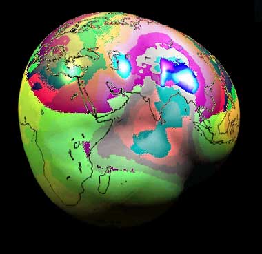
Source: [NASA] (GRACE project)