![[Home]](http://meatballwiki.org/meatball.gif) VisualAcuity
VisualAcuity
MeatballWiki | RecentChanges | Random Page | Indices | CategoriesVisualAcuity is the measurement of our ability to see detail. It's important when presenting data visually to keep in mind how much of a change in the image is perceptible to a human eye. The reality, the human eye is limited by the density of receptors on the retinae. In particular, the density on the part of the retina called the fovea is important.
The fovea is a 2 degree field at the centre of your retina with over 100 000 cones (day time, high precision receptors) laid out in on a nearly hexagonal grid. The centre 0.5-degree region has the highest density. When focusing, it's this part of the eye that gives you the crispest, most meaningful image. The distance between receptors in the centre of the fovea is about one minute (1/60-degree).
It would stand to reason that the human eye can then only make out differences in contrast spaced at two minutes, as you must perceive a blank space between two lines to distinguish them: X_X. However, the human eye can actually distinguish lines separated at half that distance, one minute apart!
We do this by using superacuities, abilities that allow us to see more than just our simple receptors can. Our brain gives us these abilities by integrating the input from multiple sources and image memory (think oversampling). Stereo vision alone improves our acuity by 7% and contrast sensitivity by sqrt(2) ~= 1.41. Indeed, if the two eyes have a difference in separation as little as 10 seconds of an arc between their relative angles to the target, that is enough to perceive some depth.
Another superacuity is vernier acuity, the ability to perceive colinearity between two line segments. Humans can resolve two line segments as being distinct if they differ by as little as (and even better than) 10 seconds of an arc. This is amazing because the cones in the fovea are 20 seconds of an arc apart (many cones to a receptor). In contrast, a typical monitor has 40 pixels per centimeter. Seated at a distance of half a meter away, the eye can resolve a difference of one tenth of a pixel.
In the diagrams below, we demonstrate first vernier acuity and then visual acuity. It's obvious to most people the vertical lines are disjoint, with a one-pixel separation around the midpoint.


It's less obvious that the horizontal lines are separated by one pixel at the midpoint. (Could you tell?)
Similarly, there is also grating acuity which enables us to distinguish a pattern of bright and dark bars from a gray blob. The first of the two following images demonstrate this for most people on high enough display resolutions. Relatedly, dither patterns are often used to simulate grays on monochrome systems. The third of the images following is a black and white dither pattern.


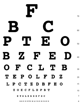
As most web designers have yet to discover, there's a limit to how small text can be as well. The ability to resolve letters is called letter acuity, and it partially uses pattern recognition to fill in the details. It's easier to read letters from a word you recognize than a random jumble. The limit here is 5 minutes of an arc, which the famous Snellen chart uses to measure 20/20 vision. Font designers have painfully learnt the absolute limit to represent the capital Latin alphabet (A-Z) and digits (0-9) is a 5x3 grid plus one pixel space (kern) between characters. On a high resolution display, this is unreadable. On a HandHeld, it's all too readable.
- Small font (5x3 pixels)
-

- Snellen chart
-

We can hack the brain to take advantage of superacuities. For instance, AntiAliasing? allows us to show more information per pixel by combining diffused data points. We could also use image memory to our advantage and display multiple lower resolution images quickly together so that the brain will integrate them together into a higher resolution image.
CategoryInterfaceDesign HumanVision