![[Home]](http://meatballwiki.org/meatball.gif) LogoMeatball
LogoMeatball
MeatballWiki | RecentChanges | Random Page | Indices | CategoriesCette page a démarré sur MeatballLogo
Pour une transclusion de l'image, l'URL du logo est :
-
http://www.usemod.com/meatball.gif
C'est l'URL du logo dans le coin en haut à droite de la page.
Le logo de Meatball [source] est disponbile en SVG. Différentes autres versions du logo ont la source disponible comme listé en-dessous. Pour faciliter la réutilisation, les fichiers GIF ont été produits. Tous les GIFS ont du blanc (palette entrée 255) tant pour la couleur d'arrière-plan que la couleur de transparence.
Grand
(taillé) ![]() (marges)
(marges) 
Petit
(taillé) ![]() (marges)
(marges) 
Tags


Tous les tags ont des marges.
OpenMeatballWiki
Bien qu'il n'y ait pas d'accord sur le nom, voici un logo pour le SiteSoeur. Soyez averti que le logo peut changer à tout moment dans un futur proche.

Histoire
Le logo original stimulé par Sunir sur une suggestion de Cliff pour jeter simplement ensemble quelque texte et vivre sa vie.
![]()
Le suivant fût 2 ans de discussions ayant abouti sur le logo en cours.
Si vous utilisez un clone de NcsaMosaic, sur votre droite vous verrez le LogoMeatball. Ce serait cool si quelqu'un faisait un meilleur travail et le postait ici.
Pour le poster (compte tenu du fait que vous ayez le bitmap) :
Hébergé à l'éxtérieur
- Copiez-le vers un espace web quelque part. Disons "http://www.0.net/logo.gif"
- Editez cette page.
- Tirez une ligne horizontale en bas de cette page en saisissant quatre tirets consécutifs (-).
- Saisissez http://www.0.net/logo.gif en bas.
- Sauvegardez la page.
Liste de diffusion
Si vous n'avez pas d'espace web, envoyez-le simplement sur la MeatballMailingList.
Merci !
Si vous postez un logo, vos efforts seront vraiment très appréciés !
Idées
WardCunningham a écrit sur la liste de diffusion :
- It has been suggested to have the earth covered with the well know "atomic" pattern with little meatballs in orbit.
Please can the new ![]() logo not have a mouse cursor in it? Sometimes
logo not have a mouse cursor in it? Sometimes ![]() I lose my mouse, and I keep thinking I've found it in the
I lose my mouse, and I keep thinking I've found it in the ![]() logo. It is as annoying as TV/Radio progr
logo. It is as annoying as TV/Radio progr  ammes with ringing telephones/doorbells
 ![]() that cause one to answer one's own phone/door. -- DaveHarris
that cause one to answer one's own phone/door. -- DaveHarris
- Désolé je n'ai pu résister --

That reminds me of radio commercials that have a siren in them. Everytime I hear one of those I start looking around for the fire truck. Besides being anoying, it seems downright dangerous to put siren sounds in a radio commercial.
The old NASA logo is referred to as the "NASA 'meatball' logo." [cf. http://history.nasa.gov/meatball.htm]

GE also has a 'meatball' logo.
![]()
Suggestions
I suppose this is out of the question -  -- JerryMuelver. You could give him brown, lumpy texture...
 though maybe a little smaller would be better. Play with fonts.... Idea would be to fill the circle with the circle-ized word, drop the box background. JerryMuelver
Now improved -- smaller, transparent background -- JerryMuelver
To me that looks like the WikiPedia logo's poorer cousin. I don't think I could live with that. ;) -- SunirShah
- I wondered where I had seen it before! The more stuff I create, the more I'm convinced that all art is derivative. What about this one?
 -- JerryMuelver
I like the ornament around it. I'd be nice if the MB part an Art Nouvea font. -- AlexSchroeder
Hey! The font is Culrz MT, stolen from PaintShop Pro! Come to think of it, the ornament looks vaguely familiar, too....Maybe we should go like this --
 (it would really be nice if it would squirt) -- JerryMuelver
![]()
Or just

![]()
![]()
Can I suggest a different slogan? Hypermedia with Sauce is not an accurate summation of the goals of MeatballWiki, which (as I understand them) are BarnRaising Online Communities and the tools you might use to do so. (OnlineCommunity) --DaveJacoby
Yes, please do. -- SunirShah
Brainstorming:
- Connecting Balls in Meatspace -- AlexSchroeder
- Meatspace, the final frontier -- AlexSchroeder
- Spaceballs, Meatballs: Connecting the planet -- AlexSchroeder
- Meatballs, and what holds them together -- AlexSchroeder
- Meatballs R Us -- AlexSchroeder
- Metaball: Face it! -- AlexSchroeder
- Meatballs helping each other out -- AlexSchroeder
- Meatball: Raising the Barn for the Next Generation -- AlexSchroeder
- Meatball: Raising the Bars for the Next Generation -- AlexSchroeder
- Meatball: Barn Raising for Generation W -- AlexSchroeder
- Meatball: Barn Raising for the Web Generation -- AlexSchroeder
- Meatball: Quick and Dirty Internet Communities -- DaveJacoby (the front-line surgery of MASH was referred to as Meatball surgery, as the point was to fix the life-threatening problems and allow the field hospitals and other facilities up the line to work on further details.)
How about, No island is an island.
Perhaps something inspired from the [Barnstar Subterfuge]


The more I think about it, the more I like the barnstar. Not only does it look nice, but its purpose is to strengthen the support of a barn, three concepts important to Meatball. However, I also like Alex's clasping hands idea. I am also visually illiterate. Maybe you should have picked someone else to be Editor. ;) -- SunirShah
I don't like the barnstar. When I look at it I think crude, mechanical, physical, old, strong, cruel, industrial. When I think of Meatball, however, I think delicate, frail, elegant, discurse, technology, internet, community, people, talk, help. -- AlexSchroeder
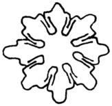
True. I'm leaning towards either the middle (meatball3) or rightmost (meatball4) of the ones you presented. Thicker has advantages, thinness has advantages.
The trouble with me is that I can't draw, so naturally I assume my input is valuable like a Wiki:PointyHairedBoss. I'm thinking about what would happen if:
- We added colour in some way, like changing it from black outline to brown.
- Put something in the centre.
- Made it imperfect like the WikiWiki logo.
But this is the same stupidity that's been causing me to drag my heels making a decision. Obviously the first two thoughts would make it complex, which is the opposite of what MeatballWiki is meant to be. And the third is unnecessary as the logo already is "imperfect" by not being perfectly symmetrical.
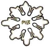
Maybe someone else has something actually useful to say. If not, what would you prefer, Alex? The only caveats I have is that the topmost head on meatball3 seems like it's been bashed in so that should be fixed, and that the name "Meatball" (or "meatball", "MB", "mb") ought to appear somewhere on the thing.

-- SunirShah
I don't like meatball4 because it looks scanned in, which makes it ugly. It's not the same as the woodblock printing of WikiWiki which looks like a woodblock printing filtered through MacDraw?. I definitely do not like Times New Roman because I'm a font bigot. In fact, there's this retailer down on South Bank here in Ottawa that used for their sign Chicago, the default Mac font from days of yore. My friends make fun of how I always have to point that out and exclaim how stupid it is. ;) Nonetheless, Times is too formal. -- SunirShah
For my OReillyPeerToPeer presentation, I am using a slightly cooked version of . Doesn't mean I'm satisfied with it. I just needed something. -- SunirShah
Have we ever eliminated the idea of using an honest-to-goodness meatball? See, for example, [1].
I was also toying around drawing some dots, with lines connecting to themselves and lines connecting to each other (representing individual communities, and links between communities). Some of my scribbles reminded me of drawings of magnetic fields, like, say, the earth's Van Allen belts. If I have time I might laboriously map out something digital along those lines, but don't expect it really soon. ;-)
How about a protozoan like [2], only more spherical? Then it's a community, a ball, something at least genetically akin to meat, delicate and frail but with great potential. The only disadvantage I can see is that it would make a terrible logo. Hey - more ideas never hurt. :)
Something more colourful and abstract, building off of Alex's design (and Jerry's GE parody, of all things!):

Which can be turned into a tag as

Or (for those with fewer pixels)
And whose source is http://sunir.org/meatball/MeatballLogo/mb-70s.svg
I tried to make the colours not suck when mixed with the standard blue and purple. http://sunir.org/apps/mb.pl (currently) uses it as the logo.
- My vote, too. My favorite colors -- light, medium, and dark negligee! -- JerryMuelver
- My vote if I have one! The rising sun banner is cool. What font is that, btw? -- JoshGrosse?
- Everyone has a say! It's Verdana, my favourite sans serif font. -- SunirShah
- I like it as well. Can we have the big, full circle and the text, though? -- AlexSchroeder
- I like the text + arc one more. -- JürgenHermann
- The arc alludes to something, so that something must be well-defined. I've attempted to satisfy Alex's concern with the below. --ss
- I like the crisp black majuscule better, even if it has to be narrowed to fit. Too much color and lumpiness makes the text look incidental to the logo. -- JoshGrosse?
I don't like a lot of ostentation, personally. I kind of liked the idea of just the circle by itself, no text, as that has a certain power to it. But it didn't seem complete either. Black/charcoal/light grey doesn't work though. It's too steep a difference; it makes the text jump out at you like the KuleshovEffect. --ss
- I really like mb-70s-text-l. That's the one we should take. -- AlexSchroeder
- Yes, good work. The big one has my vote. SVGs, hey? Damn, I'm slipping behind.-- JerryMuelver
Problem with both SVGs on this page: SodiPodi? doesn't like them. It only shows the "meatball" text for logo1.svg. What I meant in IRC, sunir, was what font did you use to make the curly braces? - t
Read the SVG. I used a <path/>, which I handrolled. They aren't curly braces, but abstract forms of people holding hands. -- SunirShah
Ah! I always took them to be spaghetti made out of curly perl-style braces... Sorry :( You've defined the path once and then applied it, I'd guess that SodiPodi? isn't smart enough to understand that. - t
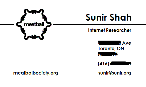
I need to make business cards. How's this look? Please criticize thoroughly.

you already fixed what i was gonna suggest after i saw the first version. :) it looks overall fine to me, really nice, actually. something kept bothering me all the while though, and i finally grabbed it and measured it in photoshop. yup. the division between the red and white parts is just slightly off the golden mean. :) i don't know whether anyone cares, but if it were my card, i would enlarge the red part just a wee bit (and adjust other things accordingly). -- AlixPiranha
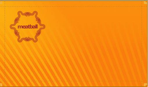
Good point! Thanks for going above and beyond the call to measure it! Here's my fixed version:

![[source]](http://sunir.org/meatball/MeatballLogo/logo1.svg)
![[2]](http://www.teaching-biomed.man.ac.uk/bs1999/bs146/biodiversity/choano~1.jpg)
![[4]](http://sunir.org/meatball/MeatballLogo/logo1-s.svg)
![[5]](http://sunir.org/meatball/MeatballLogo/mb-tag3.svg)
![[6]](http://sunir.org/meatball/MeatballLogo/mb-tag4.svg)
![[svg]](http://sunir.org/meatball/MeatballLogo/card1.svg)
![[svg]](http://sunir.org/meatball/MeatballLogo/card1-2.svg)
looking good. always amazes me how much of a difference those proportions make to my eye. i also like how the stylized person's arm comes back into the red now instead of lining up with the partition. that's one pretty business card. -- AlixPiranha
Just playing some more
- This one is the most striking of the set to me. All though I do like all three. For this one, have you considered switching the location of your name/title with the url? MarkDilley
I still like the first version (red/white one) much better than these. -- DavidSchmitt
PageTranslation LangueFrançaise MeatballLogo DossierMeatball